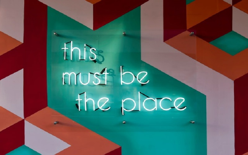
Banners are a great way to grab attention and get your message across quickly and effectively. But in order for banners to be truly effective, they need to be well-designed. Here are some tips on how to use color, typography, and other design elements to create eye-catching banners.
Banners are a great way to catch attention and get your message across quickly and effectively. But designing an eye-catching banner can be a challenge.
In this article, we’ll show you how to use color, typography, and other design elements to create banners that stand out.
Color:
One of the most important aspects of banner design is choosing the right colors. Colors can set the tone of your banner and also help to make it more eye-catching. Bright colors are often best for grabbing attention, but you should also consider the overall look and feel of your banner and choose colors that complement the rest of your design.
Color is one of the most important elements of banner design. The rights colors can make your banner more eye-catching and help convey your message.
When choosing colors for your banner, consider the following:
- Use contrasting colors to make your text stand out.
- Use bright colors to catch attention.
- Use calm colors to create a sense of tranquility.
- Use warm colors to create a sense of urgency.
- Use cool colors to create a sense of calmness.
Typography:
Another important element of banner design is typography. The font you choose should be easy to read from a distance and also complement the theme of your banner. Use size and weight to create hierarchy and interest, and be sure to leave enough white space around the text so that it’s easy to read.
The font you use on your banner is also important. The right font can help make your text more readable and add to the overall look of your design.
When choosing a font for your banner, consider the following:
- Use a Sans Serif font for a clean, modern look.
- Use a Serif font for a traditional or formal look.
- Use a Display font for a bold, attention-grabbing look.
Other Design Elements:
In addition to color and typography, there are other design elements you can use to make your banner more eye-catching. Consider adding graphic elements like shapes, lines, or images. These can help to break up the text and add visual interest. You can also experiment with different layouts and arrangements of the elements on your banner. Just be sure to keep it clean and simple so that your message is clear.
In addition to color and typography, there are other design elements you can use to make your banner more eye-catching.
Consider using images, shapes, and patterns to add interest to your design. You can also use texture and lighting to create a unique look.
When using these elements, keep the following in mind:
- Use images that are relevant to your message.
- Use shapes and patterns to create visual interest.
- Use texture to add depth and dimension.
- Use lighting to highlight important elements.
By following these tips, you can create banners that are both eye-catching and effective. Keep experimenting until you find a design that works for you.
These are just a few tips on how to create eye-catching banners. By using color, typography, and other design elements effectively, you can grab attention and get your message across loud and clear.
Conclusion:
Banners are a great way to get your message across quickly and effectively. But designing an eye-catching banner can be a challenge. In this article, we’ve shown you how to use color, typography, and other design elements to create banners that stand out. Experiment with different techniques until you find a design that works for you.
Creating an eye-catching banner requires some careful planning and design. By using color, typography, and other design elements effectively, you can create a banner that will grab attention and get your message across loud and clear. Experiment with different techniques until you find a design that works for you.
Also Check: How To Improve Dressing Sense Male


